
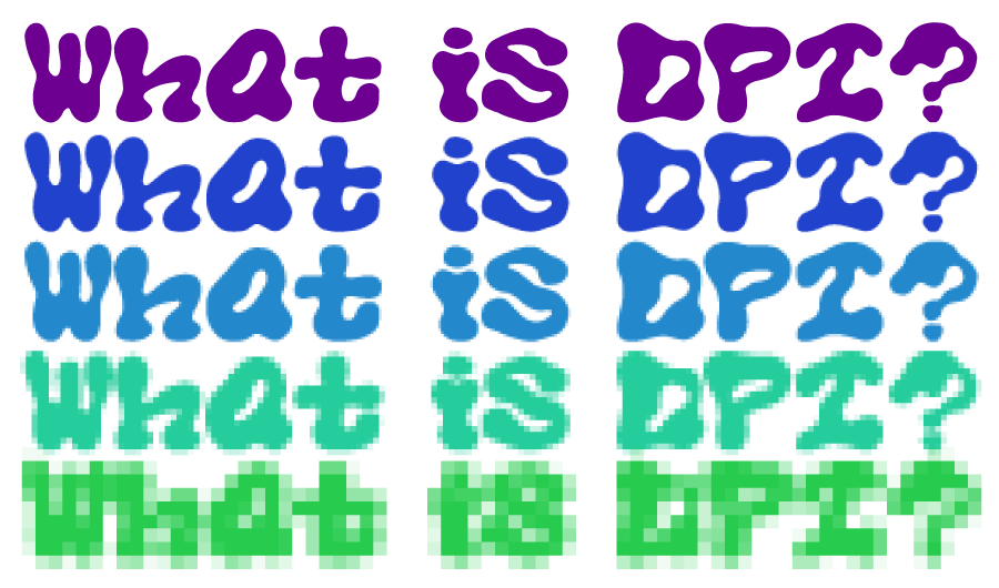
Any digital image file is made up of very small spots of color that, when zoomed out, create the image! These small spots are referred to as pixels on a screen or dots when printed.
The term “DPI” stands for “dots per inch” and is used to indicate how many dots make up each inch of your image when it’s scaled to print size! You may also encounter the term “resolution” which refers to the relative DPI of an image. High resolution refers to an image with lots of dots per inch, while low resolution describes an image with a low number of dots per inch.
Why does DPI Matter?
In order for a printed image to be printed out as as smooth and crisp as possible, it’s important for the dots in your image to be super small so they’re not visible to the eye as individual dots, but rather they blend together.
The industry standard for a high resolution print is that each inch of the image is made up of at least 300 dots. In other words, the image needs to be 300 DPI or higher!
An image that has less than 300 dots per inch runs the risk of appearing pixelated or blurry once printed as the pixels will be too large.
At sticker ninja we require a minimum of 300 DPI, but prefer files to be a minimum of 600 DPI, so it’ll print out crisper than the standard! All vector artwork we receive gets rasterized on our end to be 600 DPI 🙂
Can I scale up?
The number of dots in an image doesn’t change with scaling. If you make the image larger each dot will increase in size, rather than the number of dots increasing.
Since the dots are the information carriers in an image, resaving an image at a higher DPI doesn’t provide more information for a cleaner image so the image will still appear pixelated.
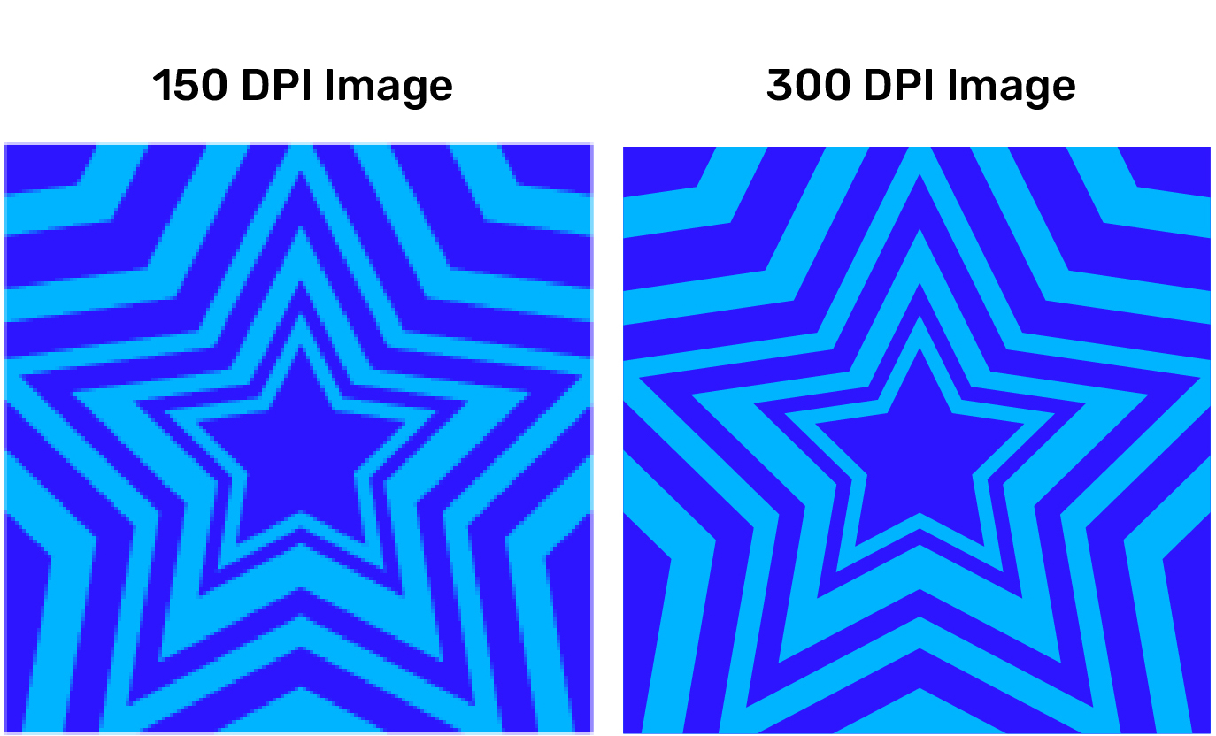
Here’s a side by side of an image at 150 DPI next to the same 150 DPI image resaved at 300 DPI. You can see that while the right side technically is high resolution, it hasn’t changed the appearance, and the pixels are all still visible leading to a jagged appearance on the lines:
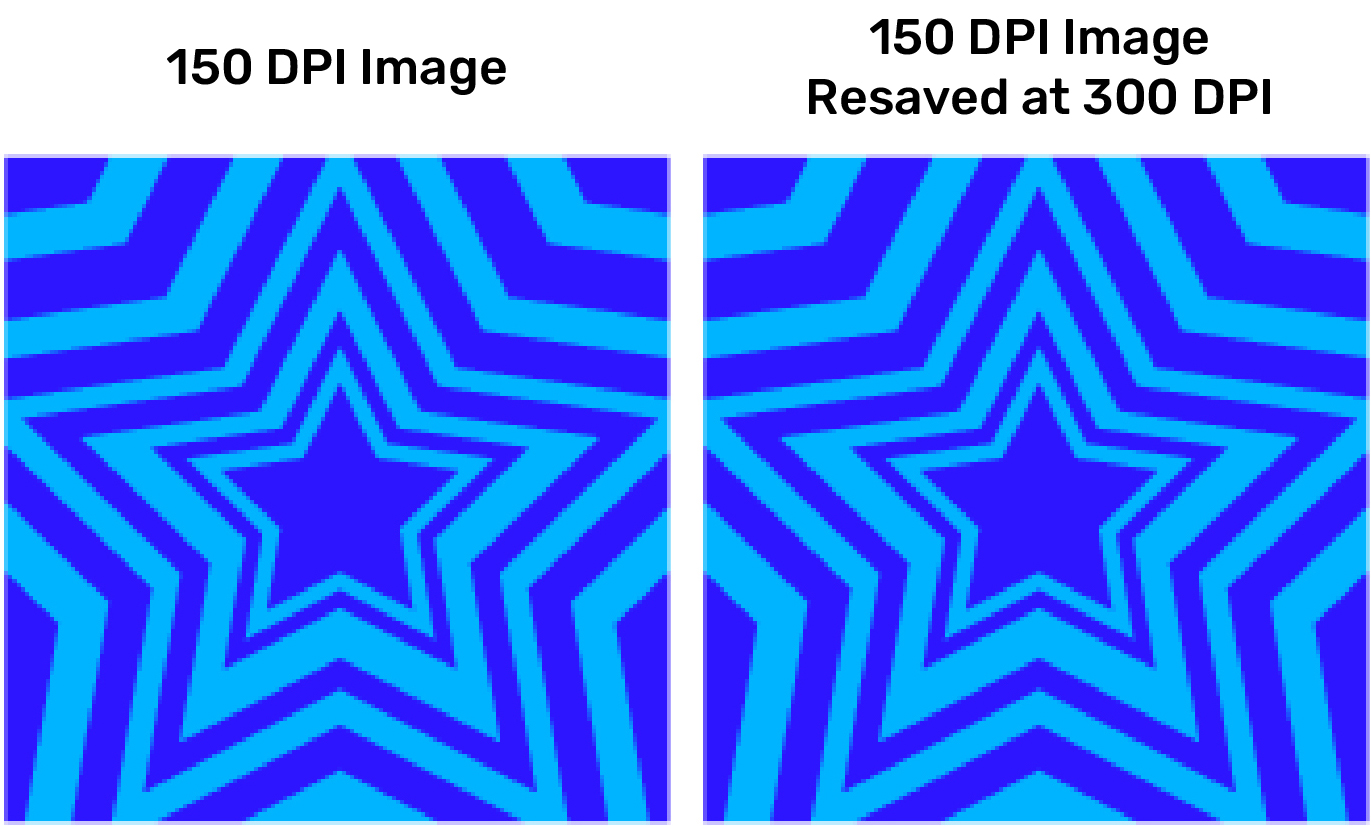
Compare this to the same image at 150 DPI next to a high res version of the image at 300 DPI. Notice how the 300 DPI image is much crisper with clear, clean lines! That’s what we’re going for when we print your art:
How to ensure high res images from the start:
Now that you know a bit about how DPI works, lets walk through how to make sure your art is high resolution and ready for print!
If you are working in a vector based program, such as Adobe Illustrator, the important thing when it comes to resolution is going to be your export settings! Always make sure the art is scaled to the size you’d like it to print, and make sure you select a high resolution in the export settings, 600 ppi is recommended: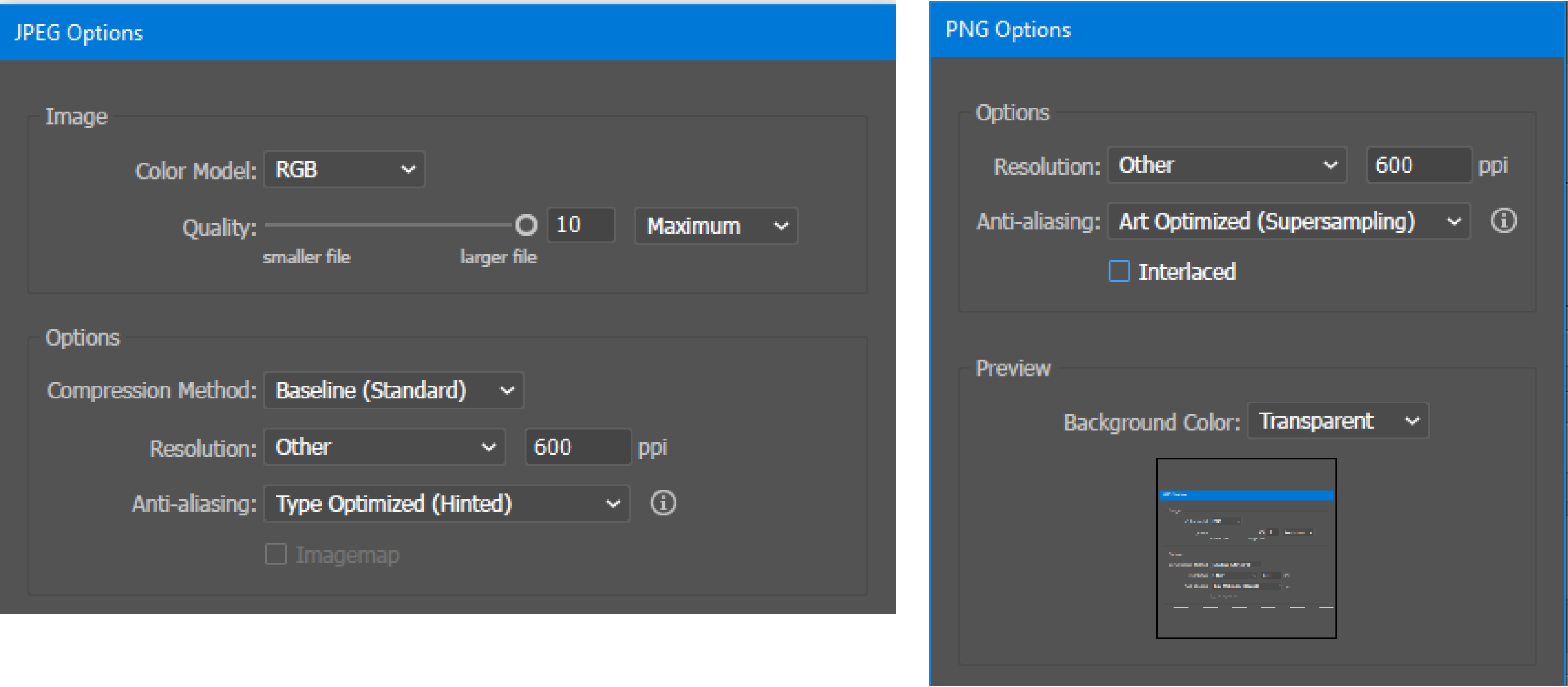
If you’re working in an image based program, like ProCreate, the important step is right at the beginning when you make a new canvas! Size your canvas to be a few inches bigger than you plan to make your stickers, and at at least 300 DPI, 600 DPI is even better! Once you’ve made your canvas, anything drawn into will stay that size/resolution and will have quality loss if it needs to be scaled up, so definitely make sure you give yourself plenty of room!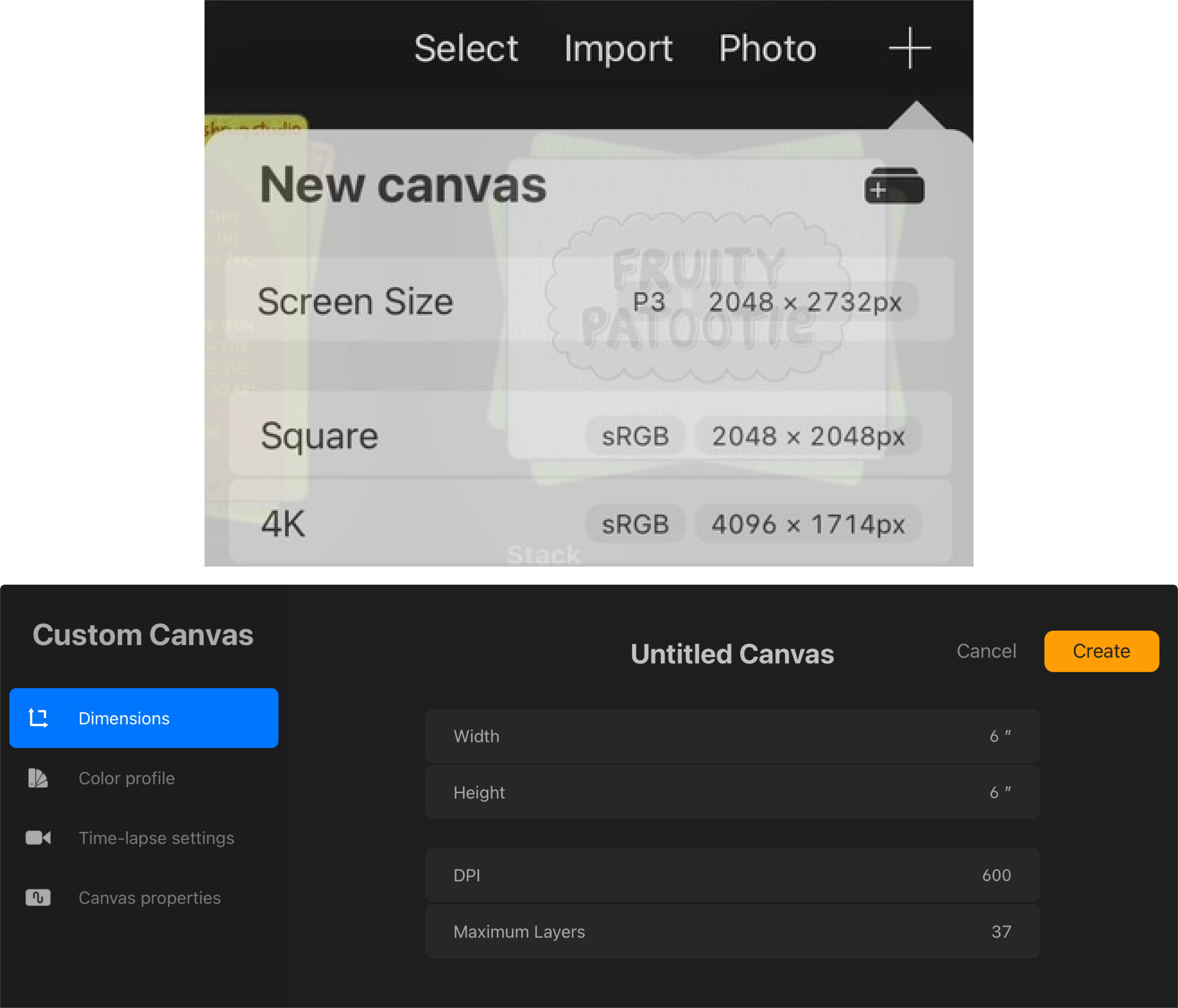
General tips from a sticker artist!
-
Work at a higher DPI than you need!
- I always work at 600 DPI that way if things can be scaled up if needed and still have plenty of resolution for print! Plus printing things at 600 DPI gives even more crisp results which is always a good thing!
Mind your canvas size!
If you are working in a 3”x3” canvas, at 300 DPI, but the art has lots of negative space around it, the image itself will be smaller than 3”x3”. Because most of the time art doesn’t go all the way to the edge of the canvas it’s advisable to work larger than you need! For a 3”x3” sticker I always work in a 5″x5″ or 6”x6” canvas. This ensures that there’s plenty of room so you don’t need to worry about sizing so you can focus on the art! The image can always be scaled down if needed.
Double check your image sizes!
If you’re working in a vector format but incorporating patterns, textures, or clip art from images, make sure those images you’re using are high resolution! This ensures that the whole image is super crisp!
Kiss Cut or Die CutWhat’s the difference?
A kiss cut sticker is cut just through the top vinyl layer, leaving the backing intact.
These can still be any shape, and kiss cuts can allow for somewhat more intricate shapes. This style is great for promos and adding extra info that may not be attractive on the sticker itself, like our sticker business cards! Kiss cuts are a great way to get creative!
We love this feature and if you need help setting this up, please ask our knowledgeable crew!
A die cut sticker style cuts through both the sticker and the backing, giving you a shaped edge that’s perfect for selling or gifting.
These tend to look more aesthetically pleasing, which makes a difference if you are in the biz of selling stickers! Though, once peeled off the backing, there is no way to tell if the product was kiss cut or die cut! ♡
Both come fully laminated and can be totally custom in shape! And if you can’t decide, we even offer a hybrid that combines the best of both! If you’d like to try this style out, you may specially request a hybrid sticker on our Glossy, Matte, Clear or Frosted material in your order notes.
Examples
Die Cut
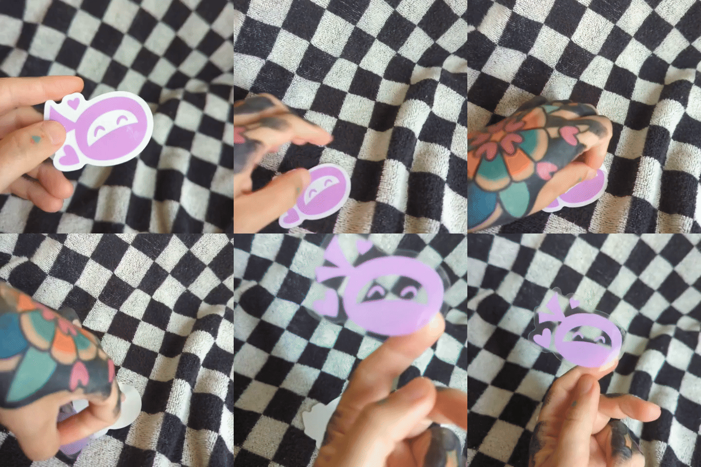
Kiss Cut
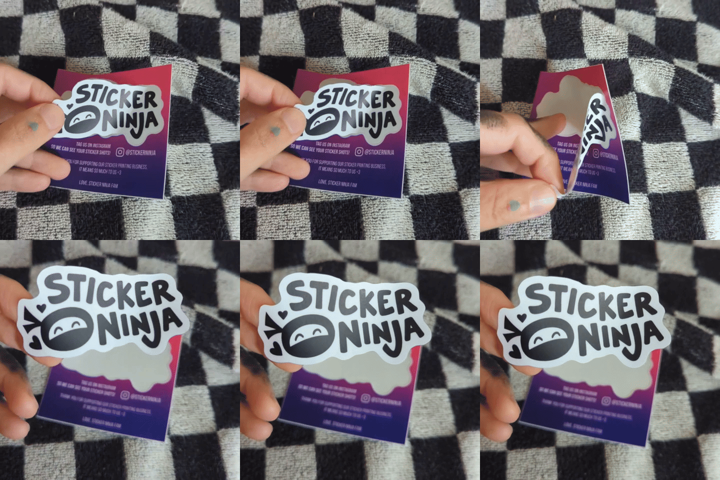
How to Get That Metallic Look ✨
Want to get achieve a metallic look within your sticker art? Here’s some hex code knowledge that you can work into your artwork!
By leaving out the white ink underneath the metallic colors, the colors will react directly onto the vinyl, giving it a metallic sheen!
As always, just leave us an Order Note letting us know what you are looking for, and we can totally make it happen 😎
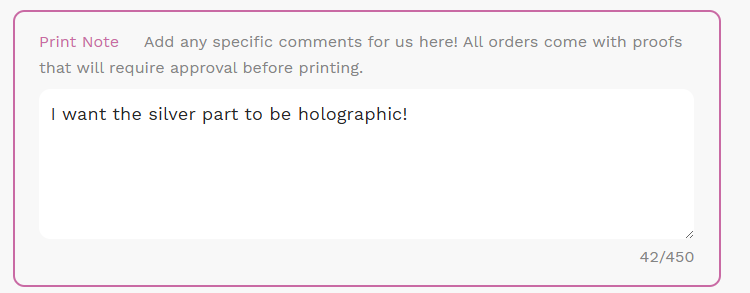
Check out below for examples of some recommended hex codes on our Vaporwave, Holographic, and our Chrome materials! 🌈
Vaporwave
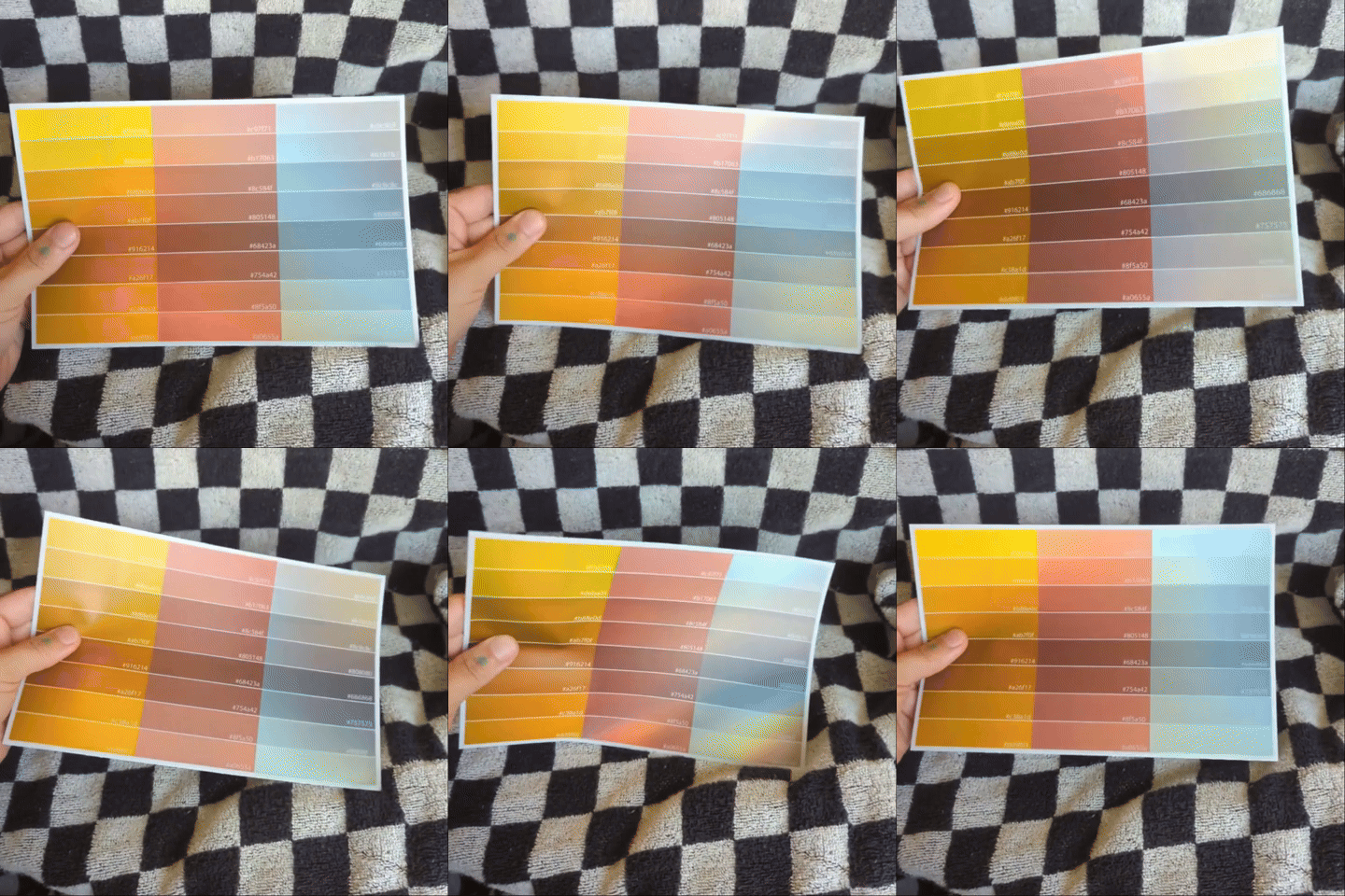
Holographic
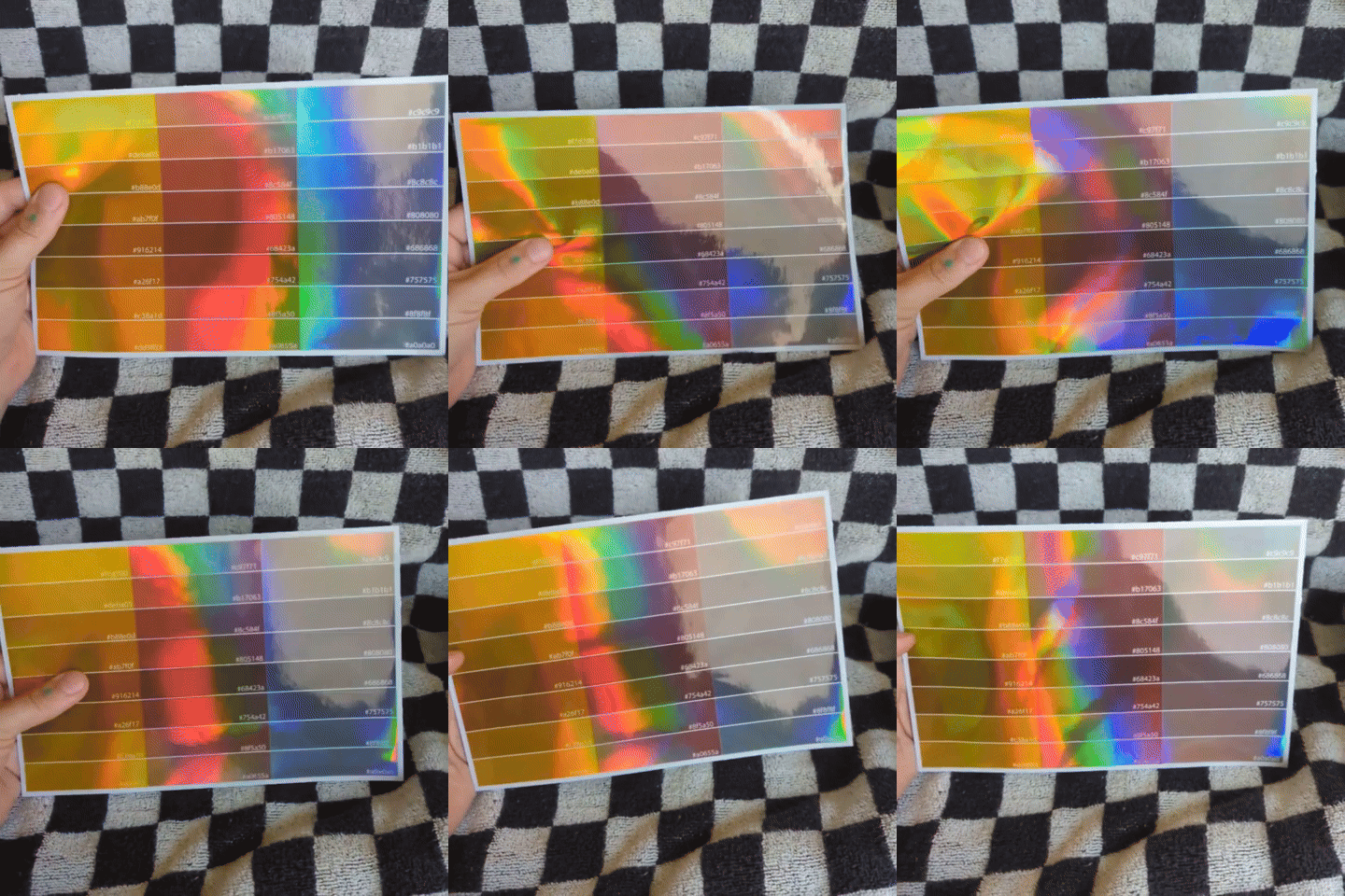
Chrome
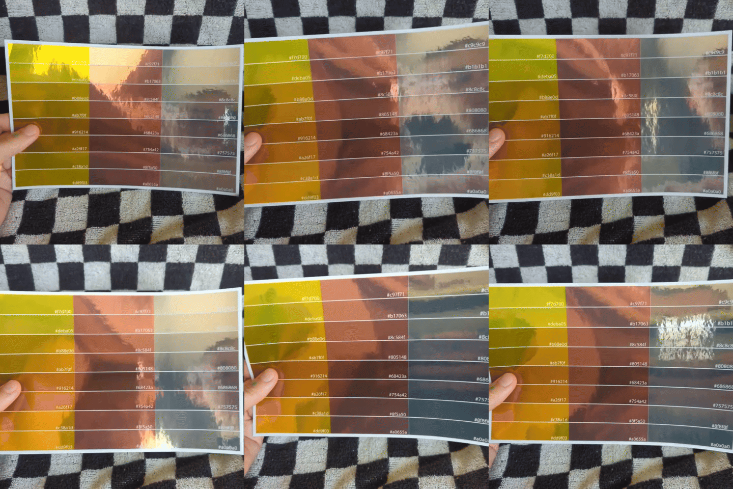
Hex codes in the samples above
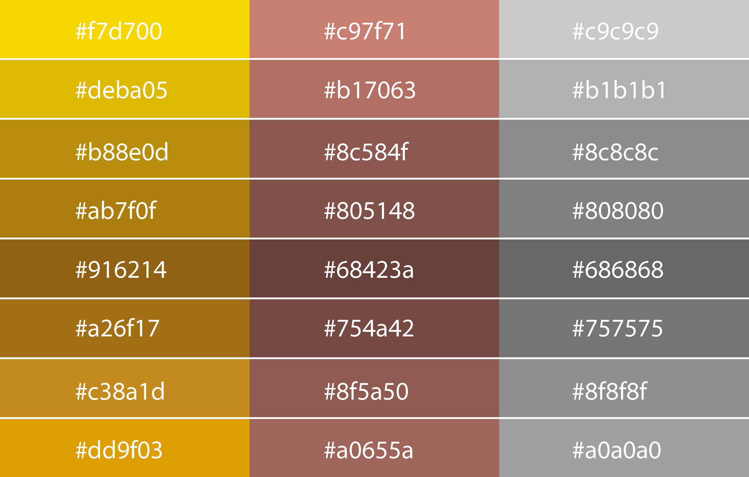
Please note you don’t need to use these exact hex codes above to get that metallic effect! These are just a helpful frame of reference 🙂